使用Vue.js 和Chart.js制作绚丽多彩的图表
2021-05-06 08:27
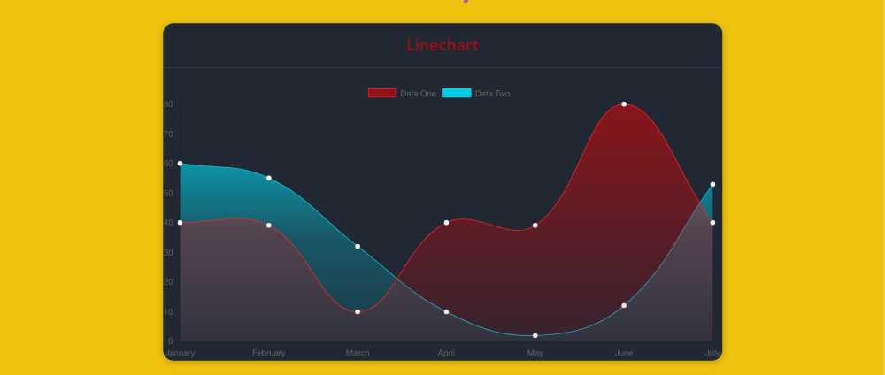
标签:tom html temp pack 依赖 efault alias keyword etc 前言 深入学习 chart.js 的选项来制作漂亮的图表。交互式图表可以给你的数据可视化提供很酷的展示方式。但是大多数开箱即用的解决方案用默认的选项并不能做出很绚丽的图表。 这篇文章中,我会教你如何自定义 chart.js 选项来制作很酷的图表。 ? Quick Start 我们需要: 使用 vue-cli 来搭基本架构,希望你已经安装好了。我们使用 vue-chart.js 来作为 chart.js 的打包器。 然后到工程目录中安装依赖: 添加 vue-chartjs: 第一个图表 现在我们来创建第一个折现表。 现在需要从 vue-chartjs 中引入折线表的基表,创建组件。 在 mount() 函数中使用我们准备好的数据和选项来调用 renderChart()方法。 代码中,使用了一些实例数据和可选参数传递给 chart.js 的数据对象,并且设置 responsive:true,使得图表会充满外层容器。 之所以可以使用 renderChart() 方法是因为我们继承了 BaseChart,这个方法和一些属性都是在 BaseChart 中定义的。 运行 & 测试 ok,现在从 App.vue 中把 Hello.vue 删掉,并且引入我们的图表: 在终端中运行 dev 脚本,就可以看到图表了。 把我变得更漂亮 现在该做些美化工作了?? ,chart.js 中有很多很酷的技巧。可以传递一个十六进制的颜色数据到backgroundColor,也可以传递 rgba() 值,还可以设置颜色的透明度。chart.js 使用的是 html canvas 来绘图的,所以我们使用 createLinearGradient()。 从这里开始才是有趣的起点,使用它我们需要 canvas 对象。但这事并不难,vue-chartjs 中已经存在一个它的引用。我们可以使用 this.$refs.canvas 来访问。 在 LineChart.js 中,我们创建了两个变量来保存渐变。代码如下: 还有另外一个函数可以使用:addColorStop() 给每个渐变创建三个颜色点: 现在就可以把 this.gradient 传递给 backgroundColor了,可以得到一个很好看的渐变。为了得到更好的效果,还可以设置 borderColor 的颜色,alpha 设置成 1 (或者用十六进制也行),设置 borderWidth 为 1,另外还可以设置 pointColor。 最后一步 最后一步是给 App.vue 的容器添加一些样式。 最终结果 最终结果如图: 英文连接:Creating stunning charts with Vue.js and Chart.js 使用Vue.js 和Chart.js制作绚丽多彩的图表 标签:tom html temp pack 依赖 efault alias keyword etc 原文地址:https://www.cnblogs.com/airen123/p/12100841.html
vue init webpack awesome-chartscd awesome-charts && yarn installyarn add vue-chartjs -Stouch src/components/LineChart.js && subl .
import {Line} from ‘vue-chartjs‘
export default Line.extend({
mounted () {this.renderChart({
labels: [‘January‘, ‘February‘, ‘March‘, ‘April‘, ‘May‘, ‘June‘, ‘July‘],
datasets: [{label: ‘Data One‘,
backgroundColor: ‘#FC2525‘,
data: [40, 39, 10, 40, 39, 80, 40]},{label: ‘Data Two‘,
backgroundColor: ‘#05CBE1‘,
data: [60, 55, 32, 10, 2, 12, 53]}]}, {responsive: true, maintainAspectRatio: false})
}})
"app">


"container">


"Chart__list">


"Chart">

Linechart
import LineExample from ‘./components/LineChart.js‘
export default {
name: ‘app‘,
components: {LineExample}}#app {font-family: ‘Avenir‘, Helvetica, Arial, sans-serif;
-webkit-font-smoothing: antialiased;-moz-osx-font-smoothing: grayscale;text-align: center;color: #2c3e50;
margin-top: 60px;}.container {max-width: 800px;margin: 0 auto;}CopyRawyarn run dev
this.gradient = this.$refs.canvas
.getContext(‘2d‘)
.createLinearGradient(0, 0, 0, 450)this.gradient2 = this.$refs.canvas.getContext(‘2d‘)
.createLinearGradient(0, 0, 0, 450)
this.gradient.addColorStop(0, ‘rgba(255, 0,0, 0.5)‘)
this.gradient.addColorStop(0.5, ‘rgba(255, 0, 0, 0.25)‘);
this.gradient.addColorStop(1, ‘rgba(255, 0, 0, 0)‘);
this.gradient2.addColorStop(0, ‘rgba(0, 231, 255, 0.9)‘)
this.gradient2.addColorStop(0.5, ‘rgba(0, 231, 255, 0.25)‘);
this.gradient2.addColorStop(1, ‘rgba(0, 231, 255, 0)‘);
borderColor: ‘#FC2525‘,
pointBackgroundColor: ‘white‘, borderWidth: 1, pointBorderColor: ‘white‘,
import {Line} from ‘vue-chartjs‘
export default Line.extend({data () {return {gradient: null,gradient2: null}},mounted () {this.gradient = this.$refs.canvas.getContext(‘2d‘).createLinearGradient(0, 0, 0, 450)
this.gradient2 = this.$refs.canvas.getContext(‘2d‘).createLinearGradient(0, 0, 0, 450)
this.gradient.addColorStop(0, ‘rgba(255, 0,0, 0.5)‘)
this.gradient.addColorStop(0.5, ‘rgba(255, 0, 0, 0.25)‘);
this.gradient.addColorStop(1, ‘rgba(255, 0, 0, 0)‘);
this.gradient2.addColorStop(0, ‘rgba(0, 231, 255, 0.9)‘)
this.gradient2.addColorStop(0.5, ‘rgba(0, 231, 255, 0.25)‘);
this.gradient2.addColorStop(1, ‘rgba(0, 231, 255, 0)‘);
this.renderChart({labels: [‘January‘, ‘February‘, ‘March‘, ‘April‘, ‘May‘, ‘June‘, ‘July‘],
datasets: [{label: ‘Data One‘,
borderColor: ‘#FC2525‘,
pointBackgroundColor: ‘white‘,
borderWidth: 1,pointBorderColor: ‘white‘,
backgroundColor: this.gradient,data: [40, 39, 10, 40, 39, 80, 40]},{label: ‘Data Two‘,
borderColor: ‘#05CBE1‘,
pointBackgroundColor: ‘white‘,
pointBorderColor: ‘white‘,
borderWidth: 1,backgroundColor: this.gradient2,
data: [60, 55, 32, 10, 2, 12, 53]}]}, {responsive: true, maintainAspectRatio: false})
}})
.Chart {background: #212733;
border-radius: 15px;box-shadow: 0px 2px 15px rgba(25, 25, 25, 0.27);margin: 25px 0;}.Chart h2 {margin-top: 0;padding: 15px 0;color: rgba(255, 0,0, 0.5);border-bottom: 1px solid #323d54;
}
上一篇:网页上传文件夹的解决方案
下一篇:websocket在vue中使用
文章标题:使用Vue.js 和Chart.js制作绚丽多彩的图表
文章链接:http://soscw.com/index.php/essay/83127.html