WPF DataGrid Custommization using Style and Template
2020-12-13 14:40
标签:des android style blog http io color os ar In this article we will go though how to change the appearance of the datagrid control. how to customize template of DataGridColumnHeader, DataGridRow, DataGridCell, DatagridRowHeader and ScrollViewer of the DataGrid. In this article you can learn, how to expand multiple RowDetailTemplate using DatagridRowHeader style, how to change ScrollBar style in DataGrid. DataGrid is a powerful control in WPF. it is used to render collection of data in customization grid. Default Column Header : Customize Column Header : Step 1 : Create style of TargetType=DatagridColumnHeader Step 2 : Create ControlTemplate of TargetType=DatagridColumnHeader and add within Template. Created border with setting Background color using LinearGradientBrush to set multiple color in linear with specified offset. LinearGradientBrush has 2 properties - StartPoint : used to fill color at given point (X and Y). - EndPoint : gradient color will stop fill to given end point (X and Y) ContentPresenter holds the Content (Data/Header Text, etc.) of the DataGridColumn. Step 3: Add VisualState for Change BackgroundColor of DataGridColumn on Mouse Hover. VisualStateManager is used for animate control when specific state changed ( Normal, MouseOver, Focus etc.) Storyboard is a container timeline that provides object and property targeting information for its child animation. In short all animations are placed within storyboard. Storyboard has Storyboard.TargetName and Storyboard.TargetProperty attached properties. these properties are used for set specified animation to target property of target control. ColorAnimationUsingKeyFrames is used to animates the value of a Color property along a set of KeyFrames over a specified Duration. In above code, added ColorAnimationUsingKeyFrames to change datagrid columnHeaderBorder control GardientStop[1] Color from #FF7F00 To LightYellow. To know more about Animation and Storyboard please read linked post. ColorAnimation added within Storyboard to change the color when user mouse over the datagrid column. Default Row : Customize Row : second one is customize style with Row Color, Alternate Row Color and Mouse Over Row Color. Step 1: Create Style of TargetType=DataGridRow In above code, created style for DataGridRow and setting Row Background Property to LightYellow. Step 2: Create Template for DataGridRow In above code, DataGridRow ControlTemplate contains DataGridCellPresenter, DataGridDetailsPresenter and DataGridRowHeader. Keep all these Presenter as it is. we need to just change the main border background color, Set the Border (DGR_Border) background color as LinerGradientBrush with combination of Yellow and rad. so each row is highlighted with this background color in grid. Step 3: Now, Add VisualState for Setting DataGridRow Background color for Alternate Row, MouseOver Row and Selected Row. For setting alternate row color, first we need to set AlternationCount property value to 2 in the DataGrid. Then, Add VisualStates (AlternatingRow, MouseOver and Selected Row) To change Alternate row color, visualstatemanager provides Normal_AlternatingRow visual state for datagrid row. In above code snippet, Three VisualState added one for AlternateRow, one for MouseOverRow and one for SelectedRow. All have ColorAnimation, that changes DGR_Border control Background‘s GradientStop[0] & GradientStop[1] color on specific state change. I have created this style for hide the default datagrid row selected color (Blue). Because even setting DataGridRow selected color, it doesn‘t affect on UI, DataGridCell default style will overwrite background color to its default one. In above code, i have set child as ConentPresenter wihtin Border control, and Border control is placed in ControlTemplate root. I sets Border control Background and BorderBrush to Transparent, so DatGridCell background is hided. Now, selected row style will applied from DataGridRow Selected VisualSate. In above code, Two Border controls are placed within grid. In First Border Backgroud is set with LinearGradientBrush, Data binded for display in RowDetails Panel. In Second Birder Background is set with RadialGradientBrush to put a light cirlce on top of the Detail Panel as show in above image (Color around Temperature Description Text in RowDetail Panel). Below image will describes how RadialGradient works (Fill the color). Path is used to create shapes or graphic objects like Triange, Hexagone, Ellipse, etc, Path is inherited from Shape class. you can also draw a picture using path. you can Fill shape with color using Fill property. The ObjectAnimationUsingKeyFrames animation allows you to use object instead of primitive values for your animation keyframes. The only DiscreteObjectkeyframes keyframe allowed in the ObjectAnimationUsingKeyFrames animation. I have set RowDetailTemplate as StaticResource because DataTemplate is created in same page. if DataTemplate or Style is placed in ResourceDictionary then you have to set Style using DynamicResource. To add ToggleButton in every row header, you need to set RowHeaderTemplate, as shown in above source, ToggleButton control is set in DataTemplate of DataGrid RowHeaderTemplate. it will show triangle image (created using path) on every row header like : Now, we need to Expand RowDetail on click of Triangle or we can say on TogggleButton checked Step 5: Handle ToggleButton click event to Expand/Collapsed RowDetail First you have to set one property in DataGrid Style for change RowDetail Visibility on DataGridRow selected This will set RowDetailVisibilityMode to Visible when perticular DataRow is selected. In ToggleButton click event, first find current datagrid row of selected togglebutton usingVisualTreeHelper.GerParent method. VisualTreeHelper is used to perform task involving nodes in visual tree. GetParent method will Returns a DependencyObject value that represents the parent of the visual object. Now, set the DataGridRow IsSelected property based on ToggleButton checked state and DataGridRow.DetailsVisibility. Step 6: Add Event Handler - RowDetailsVisibilityChanged to manage ToggleButton checked state - Create Method in .CS file that will find FrameworkElement by name from Parent DependencyObject. Above method will iterate through all children available in Parent DependencyObject and return child control by its name. This mehod is recursive method, it will call method itself until child control found or up to last child element whatever is first. if child element not found, it will iterate till last child element and return null value. VisualTreeHelper.GetChild method will find first child in Visual Tree. - Create DataGrid RowDetailsVisibilityChanged Event Handler Above method will find ToggleButton from Selected DataGridRow Template. If ToggleButton found then, set its IsChecked property to true if DataGridRow DetailsVisibility=Visible otherwise set IsChecked property to false. this method is only for the purpose of change the Expand/Collapsed Path(Shape) based on row detail visibility changed. Change the Repeat Button Template to remove default style. Added Border control within ControlTemplate and set Background to Transparent. now placeContentPresenter within Border, ContentPresenter is used to displays the content of ContentControl. when you going to customize the template of control do not forget to put ContentPresenter within Template otherwise your data will not display. Step 2 : Create Required Brushes and Color Resources WPF provides following different types of brushes : - SolidColorBrush : will paints an area with solid color. - LinearGradientBrush : will paints an area with linear gradient . - RadialGradientBrush : will Paints an area with a radial gradient. A focal point defines the beginning of the gradient, and a circle defines the end point of the gradient. - ImageBrush : will paint an area with image. - DrawingBrush : Paints an area with a System.Windows.Media.Drawing, which can include shapes,text, video, images, or other drawings. Brushes are used to Fill/Paint objects/FrameworkElements with Graphics/Colors. I have created brushes for Default, Hover and Pressed state of ScrollBars. Step 3: Create ScrollBar Thumb Style Created style of TargetType=Thumb, it will apply Thumb style in scrollbar by setting Style to StaticResource/DynamiceResource. Added Rectangle control within ControlTemplate and setting Fill property to {TemplateBinding Background} , this TemplateBinding will bind color from Control Background, so it will set Rectangle Fill color to BackgroundBrush ( 转载:http://www.codeproject.com/Articles/586132/WPF-DataGrid-Custommization-using-Style-and-Templa
WPF DataGrid Custommization using Style and Template

Introduction
Background
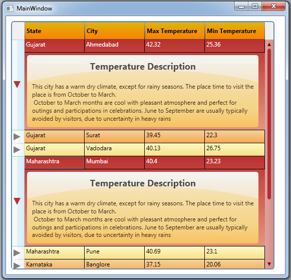
Using the code
DataGridColumnHeader Style


1
1
1
DataGridRow Style

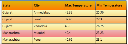
As shown in above 2 figure, first one is default DataGrid style,1
1
1
1
DataGridCell Style
1
DataGrid RowDetail Template
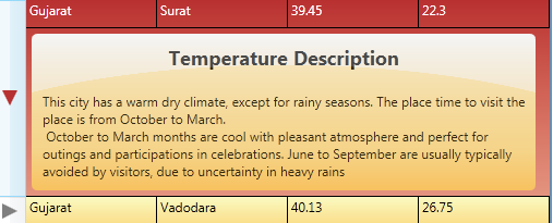
Step 1: Create DataTemplate for RowDetails
1
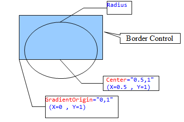
Step 2: Create ToggleButon style for Show/Hide RowDetail Panel.
1
Created Two Shapes using path, one for Collapsed RowDetail Panel, one for Expand RowDetail Panel.


Step 3: Add VisualState for Change Path on Checked/Unchecked State.
1
In above code, Visiblity of Expand/Collapsed Path is changed using ObjectAnimationUsingKeyFrames on CheckedVisualState.
On Checked State of ToggleButton Expanded Path‘s color changed using ColorAnimationUsingKeyFrames.
SplineColorKeyFrame is used to animates from the Color value of the previous key frame to its own Value using splined interpolation. it creates a variable transition between values which is determined by the KeySpline property.
Step 4: Set RowDetailTemplate in DataGrid and Add ToggleButton in RowHeaderTemplate.
1
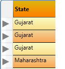
1
 1 private void ToggleButton_Click(object sender, RoutedEventArgs e)
 2 {
 3     DependencyObject obj = (DependencyObject)e.OriginalSource;
 4     while (!(obj is DataGridRow) && obj != null) obj = VisualTreeHelper.GetParent(obj);
 5     if (obj is DataGridRow)
 6     {
 7         if ((obj as DataGridRow).DetailsVisibility == Visibility.Visible)
 8         {
 9             (obj as DataGridRow).IsSelected = false;
10         }
11         else
12         {
13             (obj as DataGridRow).IsSelected = true;
14         }
15     }
16 }
1
 1 public static FrameworkElement GetTemplateChildByName(DependencyObject parent, string name)
 2 {
 3     int childnum = VisualTreeHelper.GetChildrenCount(parent);
 4     for (int i = 0; i )
 5     {
 6         var child = VisualTreeHelper.GetChild(parent, i);
 7         if (child is FrameworkElement && ((FrameworkElement)child).Name == name)
 8         {
 9             return child as FrameworkElement;
10         }
11         else
12         {
13             var s = GetTemplateChildByName(child, name);
14             if (s != null)
15                 return s;
16         }
17     }
18     return null;
19 }
 1 private void dataGrid1_RowDetailsVisibilityChanged(object sender,DataGridRowDetailsEventArgs e)
 2 {
 3     DataGridRow row = e.Row as DataGridRow;
 4     FrameworkElement tb = GetTemplateChildByName(row, "RowHeaderToggleButton");
 5     if (tb != null)
 6     {
 7         if (row.DetailsVisibility == System.Windows.Visibility.Visible)
 8         {
 9             (tb as ToggleButton).IsChecked = true;
10         }
11         else
12         {
13             (tb as ToggleButton).IsChecked = false;
14         }
15     }
16
17 }
DataGrid ScrollBar Style

Step 1 : Create Repeat Button Style
1
1
1
上一篇:python世界level2
下一篇:Java8--Lambda表达式
文章标题:WPF DataGrid Custommization using Style and Template
文章链接:http://soscw.com/essay/34323.html